


There are changes coming to Buick, and they start with the rumors of a new logo. Is this American brand just looking to update its image, or does the new logo signify major changes coming to its lineup and approach to the market?
While it may take some time to know all of the facts, it’s clear to see that Buick has something up its sleeve. Here’s what we know so far:
The Logo of Luxury
Buick’s current logo is one of the most recognizable logos in the automotive industry. This brand is currently represented by a Tri-Shield logo. The origin of this image is connected to the original Founder, David Dunbar Buick. It wasn’t until 1937 that the GM marketing team learned of the founder’s Scottish origins. That’s when they decided to go with the Scottish Military Emblem.
The original log was just a single shield. It wasn’t until 1959 that it evolved to three shields. Each of the three shields was meant to represent Buick’s three models: LeSabre, Invicta, and Electra. Even though Buick now has a much larger and diversified lineup, the three logos remain. You will notice that it changed colors from the original red, white, and blue to a more chrome look.
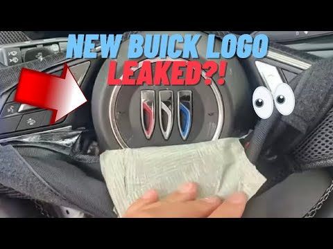
Rumors Of A New Logo
General Motors recently filed for a trademark of a revised variant of the Tri-Shield logo we all know today. Instead of arranging the three shields in a diagonal pattern, with the lowest on the left and moving up to the right, the new design arranges all three shields horizontally. The new design also removes the ring around the shields and is of a single color.
With a closer look, many Buick fanatics will notice the absence of the diagonal line that went through each of the three shields. Instead, there is a curved line. This curved line appears to be more to stay on point with other modern logos from companies like BMW and Nissan.
The Meaning Behind The Change
To date, neither Buick nor GM have confirmed that the new logo is happening. The trademark could have a variety of other implications, but it’s hard to ignore. Throw in the recent trademark for the name “Electra” and GM’s promise to completely dive into electric vehicles in the next ten years, and it seems like Buick is getting ready for some changes.
Of course, not everyone is thrilled with the new design. Comments on social media channels show people comparing the new logo to fangs and claw marks. Others are encouraged to see some changes in hopes that Buick is going to catch up in the electric market.
It’s hard to say exactly what’s happening at Buick headquarters, but it definitely seems like something big is coming. Only time will tell.
This post may contain affiliate links. Meaning a commission is given should you decide to make a purchase through these links, at no cost to you. All products shown are researched and tested to give an accurate review for you.